Make Headlines
Curated by Arianna Orland
Tell us a little about why you selected these typefaces.
I chose these typefaces because of my undying devotion to wood type. Seeing the collaboration between P22 Type Foundry and the Hamilton Wood Type & Printing Museum to bring typefaces that were previously only available in the analog world to the digital world makes my heart sing.
These fonts would all make fantastic, powerful, direct headlines. Whether you want to be straightforward or a little more flourished, these beautifully handcrafted letterforms are perfect for eye-catching statements that sit at the top of your communication hierarchy.
Tell us a story about you and fonts.
I’ve used countless fonts throughout my professional career but when it comes to Paper Jam Press and our letterpress posters, I’m in a long term relationship with typecase.
Technically it belongs to the SF Center for the Book. It’s a bold, uppercase, gothic, wood type that would have been used primarily for headlines back in the day. The type was created using a pantograph, which means each individual block was traced by hand using the device, so there are slight variations from one letter to the next. If you look close enough no two letters look exactly the same, which I love. The wood is slightly porous too, so over time the type has taken on nicks and scratches as well as being stained from the many different inks passed over it.
Another secret I’ll let you in on about this particular typecase is there are no I’s or K’s. I bring my own with me every time I print. Can I Kick It // Yes You Can is a best seller of ours and we have to print the Can I Kick It poster in two passes. One pass that reads “Can I Kic It” and the second that reads “k”.
What is your advice for people new to typography?
Don’t be intimidated, get curious instead. All you need to get started is a basic understanding of what you’re trying to achieve and the willingness to spend a little time getting lost in what’s out there. Think of the time spent in the beginning as investing in your education.
Also, start paying attention to typography you see in the world around you and make note of it by taking a picture. You can drag and drop your pictures directly onto the Adobe Fonts website and it will suggest similar fonts. It’s absolute magic.
Fonts in this pack
-
{{item.full_display_name}}{{collectionCtrl.getExampleText(item)}}
-
{{item.full_display_name}}{{collectionCtrl.getExampleText(item)}}

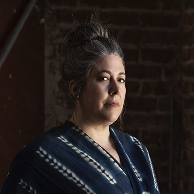
About Arianna Orland
Arianna Orland is a creative leader and artist with over 20 years experience working on both coasts for startups and Fortune 500 companies leading brand, marketing, and product work. She is the founder of Paper Jam Press, a letterpress poster company. Arianna is also the co-founder of In/Visible Talks, a conference for creative professionals that celebrates the art of design. Arianna believes that design is an act of courage and challenges us all to step bravely forward.