The Way Back Pack
Curated by Annie Atkins
Tell us a little about why you selected these typefaces.
I make graphic art for period filmmaking, which means I’m always looking for fonts that were used on old documents, like letterpress handbills. Each of the fonts I’ve chosen for this pack can pass as something that might have been used in late 1800s advertising.
Tell us a little about why you selected this theme.
The hoardings we built for London’s Victorian slum scenes in the Gothic Horror series Penny Dreadful were plastered with all kinds of public service announcements warning the crowds about loitering, philandering, and the spread of incurable disease. Even though these pieces are rarely given a close-up, sometimes the artwork we make is purely to create the right atmosphere for the cast and crew. The details on these things can add up to a much bigger picture, and making the right font choices is a crucial part of the film design process.
What is your process for selecting typefaces?
My first port of call in creating any piece for a film is to find good reference material. If I don’t have a real antique piece in front of me then it can be very difficult to imagine what lettering styles might have been used at any given time. For example, I would never have expected to see an outlined shadow font on an old 1800s handbill, but this came from a real Government-issued poster from 1879, and I used this reference as inspiration for the posters in Penny Dreadful.
What is your advice for people new to typography?
Don’t be afraid! When I was starting out in advertising a million years ago I felt quite shy about choosing fonts, which meant I almost always used Helvetica. Looking back now I wish I’d experimented more, like I do in my design practice today. Sometimes I get it wrong and sometimes it’s right, but it’s only through playing around with things that I know what works.
Fonts in this pack
-
{{item.full_display_name}}{{collectionCtrl.getExampleText(item)}}
-
{{item.full_display_name}}{{collectionCtrl.getExampleText(item)}}

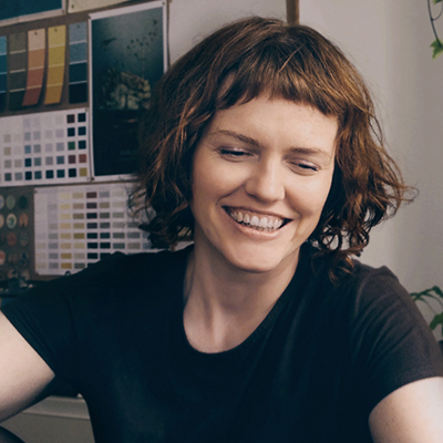
About Annie Atkins
Secret love letters, fake telegrams, prison escape maps… Annie Atkins is a master forger in Dublin, Ireland, creating graphic props and set pieces for movies all over the world. Annie has designed the graphics for the animated feature The Boxtrolls, Spielberg’s Cold War thriller Bridge of Spies, and Wes Anderson’s Grand Budapest Hotel – which went on to win the Academy Award for Best Production Design. Her most recent work can be seen in Anderson’s stop-motion animation Isle of Dogs.